
Lutruwita Art Orchestra
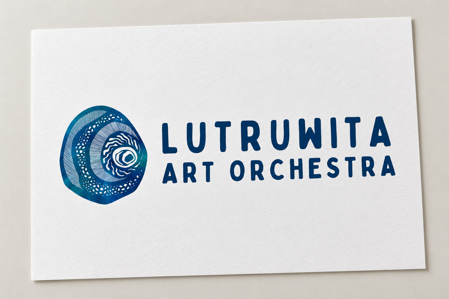
I developed a visual identity for Lutruwita Art Orchestra that brings together original artwork, coastal forms and watercolour textures.
ARTIST & DESIGNER ● DIGITAL ILLUSTRATION, GRAPHIC DESIGN & BRANDING ● LUTRUWITA/TASMANIA ● 2024
Working with Lutruwita Art Orchestra as the ensemble was forming, I developed a visual identity reflecting its diversity, creative vision and connection to our island home. The commission began with an original artwork shaped by gathering, welcoming and the waters surrounding Lutruwita.
Organic forms, flowing line work and watercolour textures became the foundation for a logo and broader identity extending across stationery, social media, concert materials, publications and digital communications. Supported by practical brand guidelines, the identity brings their collective spirit into a consistent visual language that can travel with their music.
THE COMMISSION
CEO Frances Butler and Artistic Director Stevie McEntee approached me as Lutruwita Art Orchestra was taking shape. They wanted a bespoke identity that reflected the diversity of the ensemble, its creative work and its connections with community, musicians and the broader arts sector.
The brief was to create something strong, distinctly Tasmanian and recognisable. As an art orchestra, they also wanted an identity with an artistic presence of its own. The artwork needed to stand independently, function as a brand mark and sit comfortably alongside the organisation’s name in a complete logo.
This gave me the freedom to approach the commission through my artistic practice, developing a visual language that could hold the collective’s character while supporting its everyday communications.
COUNTRY & COMMUNITY
Our early conversations returned to gathering, welcoming, diversity and water. These themes offered a way to connect the ensemble’s vision with the island we share.
I developed organic shapes that reference Lutruwita, its coastlines and the surrounding waters. Flowing forms and linework speak to togetherness, connection and the movement of creative ideas between people.
I wanted the artwork to have a sense of calm and openness, reflecting the collective’s approach to bringing people, music and cultures together. The resulting composition is an artistic interpretation of our island home, our shared connections and the creative work of the orchestra.
IDENTITY DEVELOPMENT
The artwork developed intuitively through abstract shapes, negative space and my signature linework. I began in Procreate, allowing the composition to emerge before refining it into the brand mark. Early feedback was positive, with only minor changes needed as the design progressed.
The colour palette grew from a watercolour painting I had created several months earlier. Scanning the painting at high resolution allowed me to bring its textures and variations into the identity. Its blues and teals connected naturally with the themes of water, fluidity and connection.
I then took the artwork into Adobe Illustrator to prepare the vector files. Testing at different sizes helped me refine the detail and maintain clarity across applications.
Typography brought another dimension to the identity. Bobby Jones Soft complemented the organic artwork with rounded, playful lettering, while Glacial Indifference and Montserrat provided structure for headings and body text. Together, these elements balanced the expressive character of the artwork with the practical needs of the organisation.
COLLABORATION & APPLICATION
I worked closely with Frances, Stevie, ensemble members and the board, incorporating collective feedback throughout the development process.
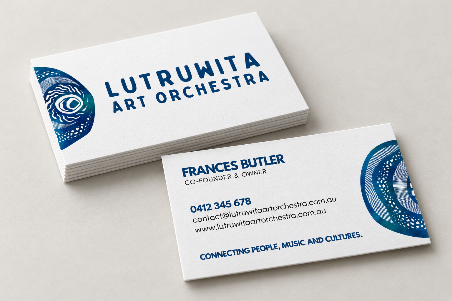
Alongside the artwork and logo, I created stationery and social media templates. The brand guidelines brought together the logo variations, typography, colour palette and supporting graphics, giving the ensemble a shared reference for consistent use.
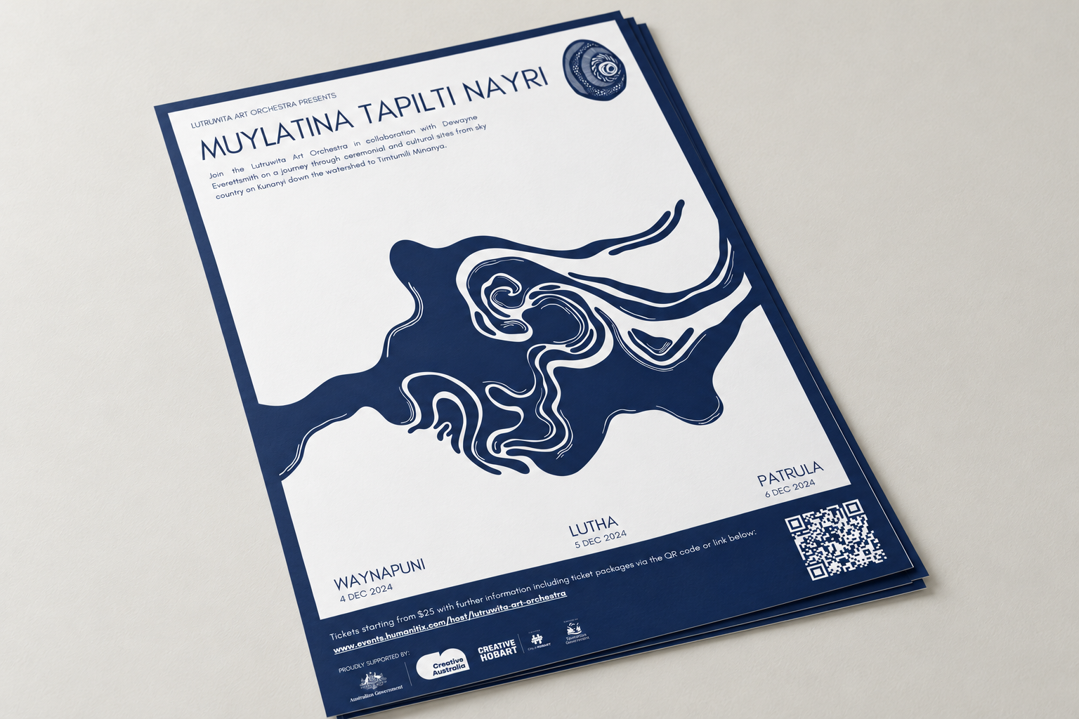
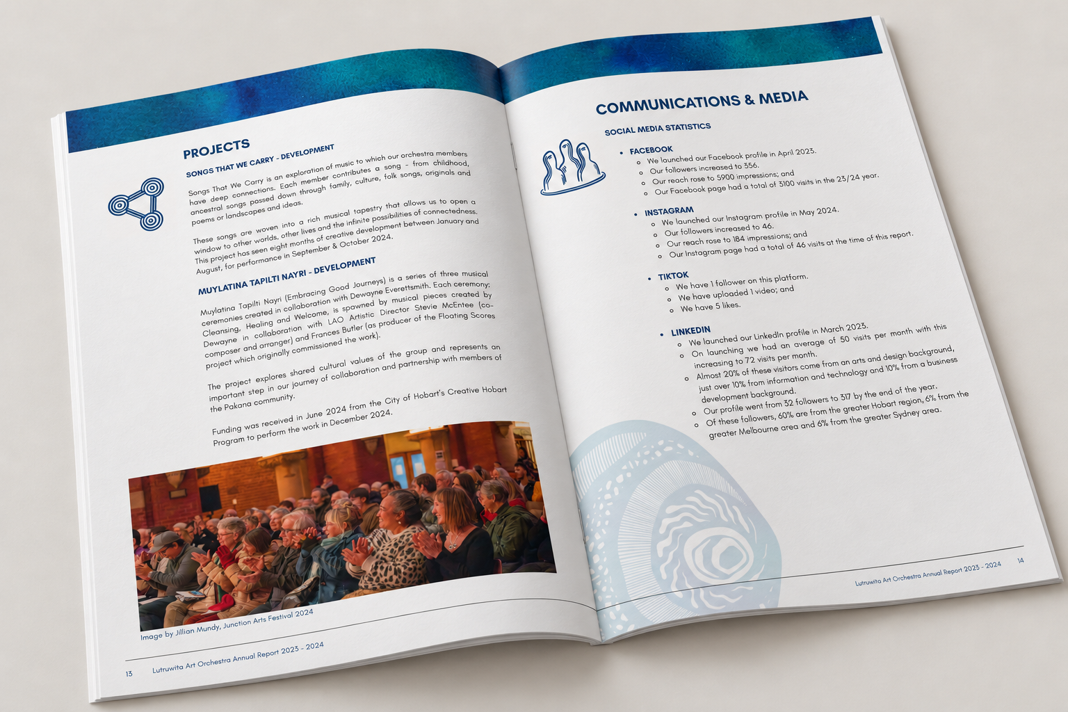
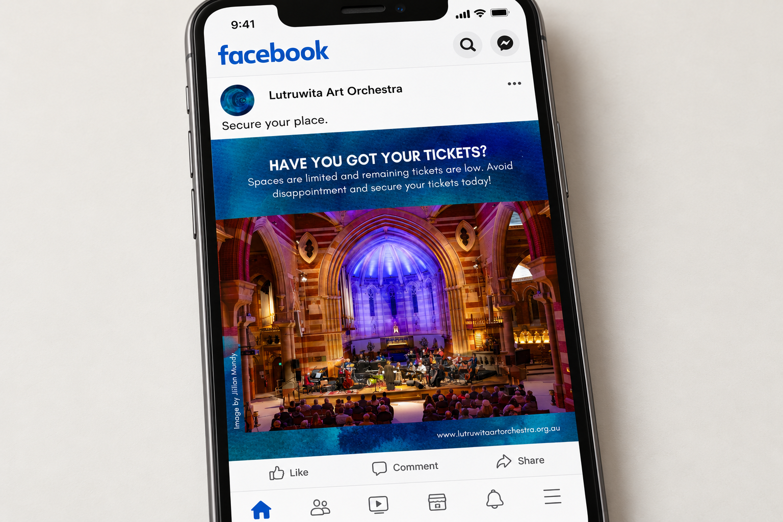
The identity extended into concert graphics, programs, social media assets, annual reports and website elements. Each application drew from the same artwork, colours and textures, allowing the organisation to communicate across different formats while retaining a recognisable character.
The guidelines also gave the collective a practical foundation for continuing to use the identity beyond the initial commission.
LAUNCH & OUTCOMES
Work began in early 2024, with the identity introduced around the middle of the year as the ensemble prepared to tour.
The response from the orchestra was enthusiastic. With departure approaching, the ensemble organised hoodies featuring the logo across the back, carrying the artwork with them as they travelled and performed.
Members of the public, audiences and stakeholders have since shared positive feedback about the artwork and visual identity. The original design remains in use across the orchestra’s communications, connecting its publications, performances and digital presence through a consistent visual language.
PROJECT CREDITS
Artist & Designer:
Caleb Nichols-Mansell
Client:
Lutruwita Art Orchestra
Collaborators:
Frances Butler
Stevie McEntee
Photography reproduced within the annual report and Facebook mock-ups by Jillian Mundy, for Lutruwita Art Orchestra.